Built Oregon
Built Oregon is a nonprofit organization that provides mentorship and support for Oregon's consumer brands. This project was a part of PDX Digital Corps, a short term volunteer project that helped local nonprofits with branding and web design. I was part of a team that included another designer whose experience and guidance was incredibly helpful.

Cleaning up the logo
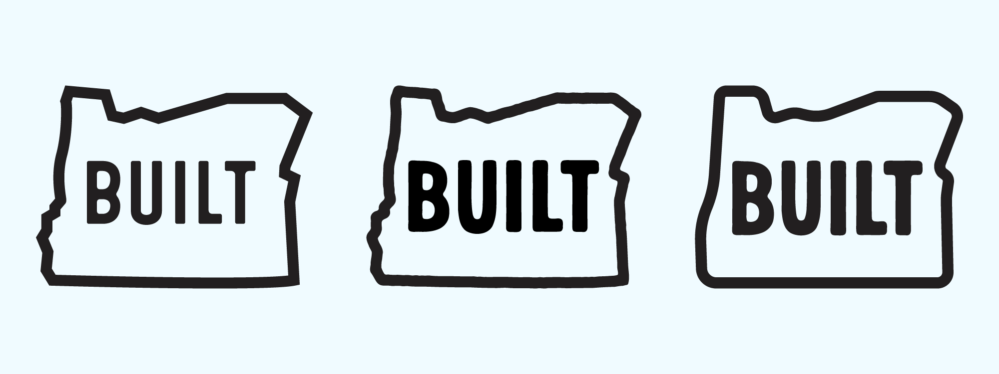
We were given carte blanche for the redesign but the organization has a substantial history that I didn't want to lose with the rebrand and I didn't really dislike old logo that much anyway. I did however think that it could use a little more impact, particularly for use on merch like stickers and shirts. My first pass kept the general outline but I made it bolder and rougher to give it a rubber stamp vibe, and after a few more revisions we landed on something smoother and a little more modern feeling.

Colors, colors, colors
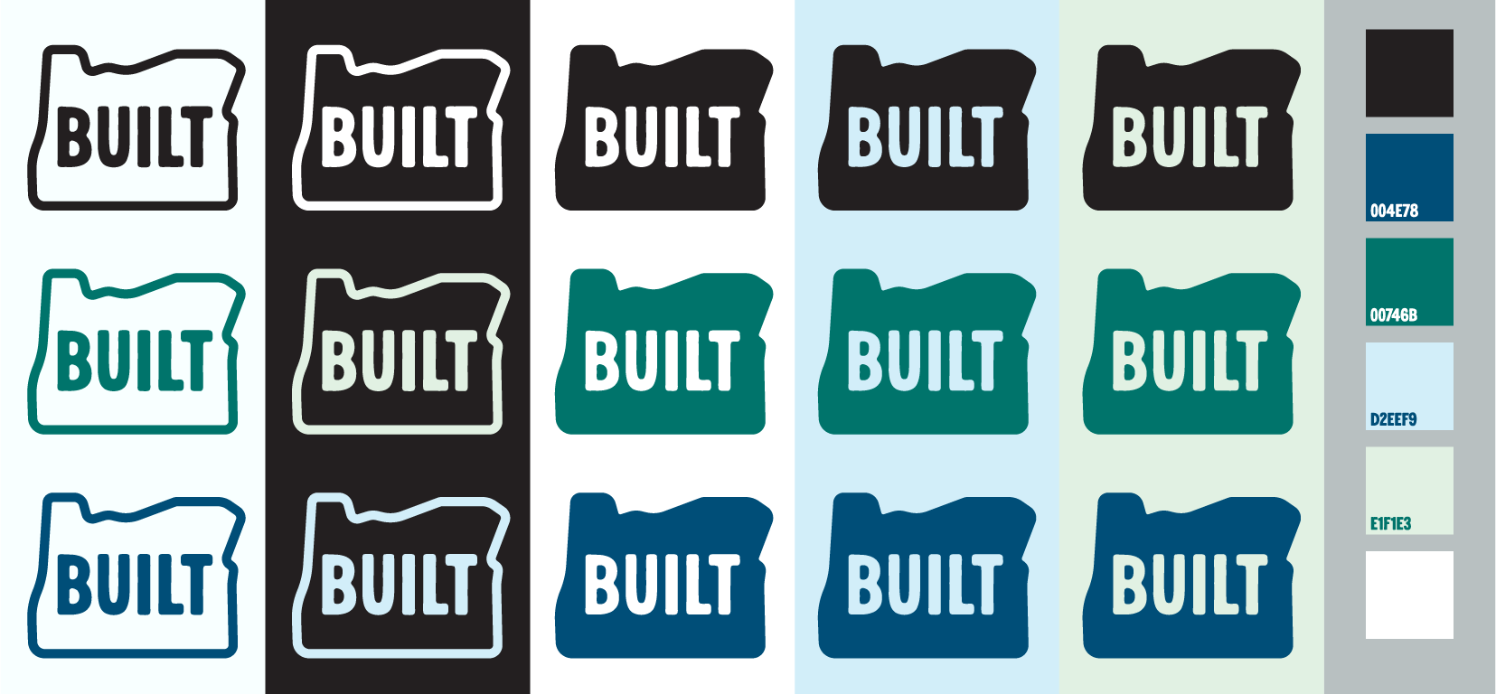
Total freedom meant that there way too much opportunity to play with the colors and this is just a small sample of experiments. In the end we decided to stick with black and white for the logo itself because it was going to be used with a lot of photos but these are the final colors we used for the website redesign.
